Are you tired of struggling to keep users engaged and satisfied with your website?
Imagine the impact of captivating your audience with a great website design flow that not only grabs their attention but also enhances their overall experience.
In this article, I compiled nine essential strategies to improve user experience that would help take your website to the next level and leave a lasting impression on your visitors.
My Takeaways
What are The Best Ways to Improve User Experience on Your Website?
1. Utilize White Space
Make your website look great and easy to use by adding in some empty space, also called white space. Think of white space as the empty room around the things in your house. It makes everything look neat and not crowded.
When you build a website, using white space helps in three ways:
But be careful – it’s like adding salt to food. Too much, and you can spoil it. If you have too much white space, the important stuff might get pushed down where people can’t see it immediately.
For a website that’s easy and fun, think about where to put white space. You want to guide people’s eyes to the right places. This is part of what makes a good website.
2. Optimize Page Speed
You need to keep your website loading times as fast as possible to ensure a positive user experience.
One way to achieve this is by minimizing the size of your images, which can significantly speed up your webpage loading.
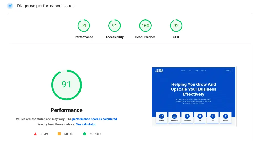
Google offers a free service to check and improve your page speed, so take advantage of this to optimize your website’s performance.
Speed up Loading Times
You need a fast-loading website to keep visitors happy. If a page takes too long to load, people might leave quickly. To make your website load faster, you can change how it’s designed.
Focus on making things run smoothly. Try to have fewer things for your browser to ask for.
Google suggests that your website should load in three seconds or less. This helps visitors have a good time on your website without waiting.
Minimize Image Sizes
When the image file size is smaller, your website can load quickly, and that makes visitors happy.
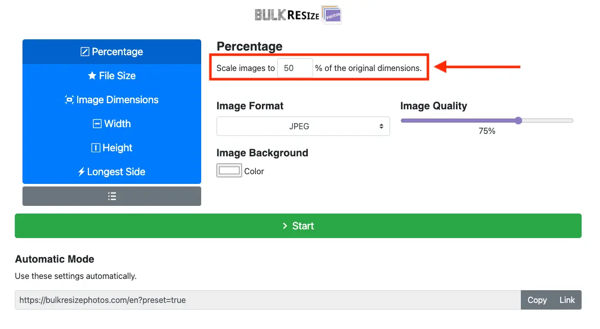
A smaller file size does not mean your image’s dimension is small. You can still have quite a large image dimension. I use tools like Bulk Resize Photos to help me reduce image file size.
You can use PageSpeed Insights to check how fast your pages load and how to make them quicker.
When your website loads faster, readers are more likely to keep coming back to you.
3. Use Attractive Calls to Action
Adding calls to action that grab attention will really help people get involved and move around your site. Here’s how to make a call to action that works well:
4. Implement Hyperlink Differentiation
You want a website that’s easy to use. Making links stand out is key to a good website. Links should look different so they’re easy to find.
When you build a website, think about how people use it. Make sure visitors can find what they are looking for quickly. This means organizing important info well.
Clickable links should be easy to spot. People expect links to have an underline or a different color. Use these clues to help visitors click on things.
Try making links blurry or colorless to test them. This checks if they still grab attention. Shorter links can also be easier to spot and use.
5. Use Bullet Points for Segmentation
6. Strategic Use of Images
Make your website look great and keep people interested by using high-quality pictures that fit well with what you’re talking about. Images aren’t just for looks—they should make your website better for everyone who visits.
Use real photos of what you sell, the things you do, or the people who work with you. This makes your site feel more real and helps visitors trust you more.
Pictures should also match what you’re saying and make everything look good together.
Here’s how to pick the right pictures for your website:
7. Craft Well-Designed Headings
Creating great headings helps you guide people on your website and makes their visits better. Keep these tips in mind to make your website look amazing:
If you’re making a website, use these ideas to create headings that aren’t only pretty to look at but also make it easier for people to use your site.
These steps will help you lead people around your site and make it simple for them to get the information they want.
8. Maintain Consistency Across Pages
When it comes to maintaining consistency across pages, it’s crucial to design with brand identity in mind.
Ensure that color and font usage remain consistent throughout your website to create a cohesive look and feel.
Additionally, focus on navigation and layout uniformity to enhance user experience.
Designing With Brand Identity
A consistent brand look on all your website pages helps people trust and recognize your brand more easily.
When you make sure every page has the same style, colors, and fonts, visitors get a comfortable and familiar feeling.
Have a look at my home page, other pages and posts. I kept its look the same everywhere. The website look is consistent.
Here is what I did to create that consistency and familiarity:
When designing your website, always think about what’s best for you as the user. Stick to these steps to keep your brand strong and easy to recognize.
Color and Font Consistency
When you keep your colors and fonts the same, your website will be more attractive and feel more professional. This makes it nicer for people visiting your site.
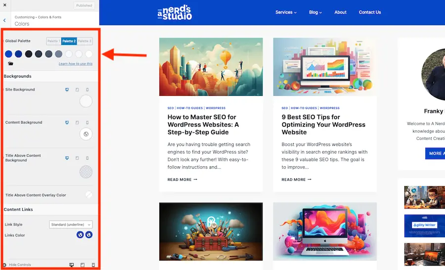
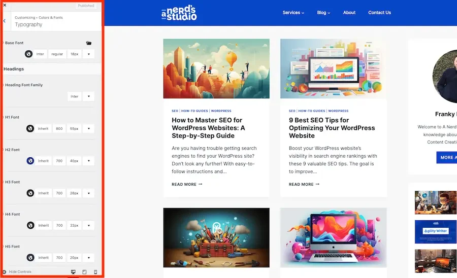
I use Kadence Theme for this website, and it has awesome features Global Colors and Global Typography. You can set them so the colors and typography will be the same throughout your whole website. You can read more in my Kadence Theme Review.
You can use tools like Adobe Colors or Google Fonts to make a guide that helps you use the same styles on all your web pages.
Make sure to check your website on different screens to see if the colors and fonts look right everywhere. You can use a tool like Crazy Egg to test how your website works for people visiting it.
Keep the design of your website the same on every page to help your visitors have a good time using it. When your website has the same navigation and design everywhere, it’s easier for people to use and find what they need quickly. A consistent website makes users more likely to explore and spend less time figuring out where to go.
Here’s what you can do:
9. Address 404 Errors
Make sure to check your website often for broken links. These links can cause 404 errors, which aren’t good for your visitors or your site’s search engine ranking. When someone finds a 404 error, they might get annoyed and leave your site.
Use tools and plugins like Rank Math SEO that can find and repair these errors. This will help keep your site running smoothly so visitors don’t run into broken links. You can read my Rank Math review to get more information.
To make things better, set up a special 404 error page. This page should have clear directions and links to help visitors get back to your main site. This way, they can find what they are looking for with ease.
Conclusion
To wrap things up, think of your website as a cool hangout spot where everyone wants to go. You want it to look awesome and feel easy to walk around in.
Imagine using blank space like an open field where your eyes can take a break and making sure your website loads super fast, like a race car zooming by.
Add some shiny buttons that invite you to click on them because they look so fun and friendly.
Make sure your website feels like your favorite comfy hoodie—every part fits just right and feels the same.
And if someone hits a dead end, like a ‘Page Not Found’ sign, help them out quickly so they don’t feel lost.
By doing all these things, you’ll make people happy to visit your website, and they’ll want to return again and again, just like a favorite hangout.